UI Design
Lua Learning needs a consistent feel and flow for the UI.
In terms of managing it programatically, we use theme.lua and Fusion.State to hold our color and sizing values and automatically update all dependant elements.
Colors
Dark Theme:
Main Background
Light Background
Dark Background
Dark
Light
Accent
AccentText
MainText
BrightText
SubText
Button
ButtonText
Light Theme:
Main Background
Light Background
Dark Background
Dark
Light
Accent
AccentText
MainText
BrightText
SubText
Button
ButtonText
Inspiration/Reference
In terms of actual design, however, I suck. Let's take inspiration from those who are far better than I.

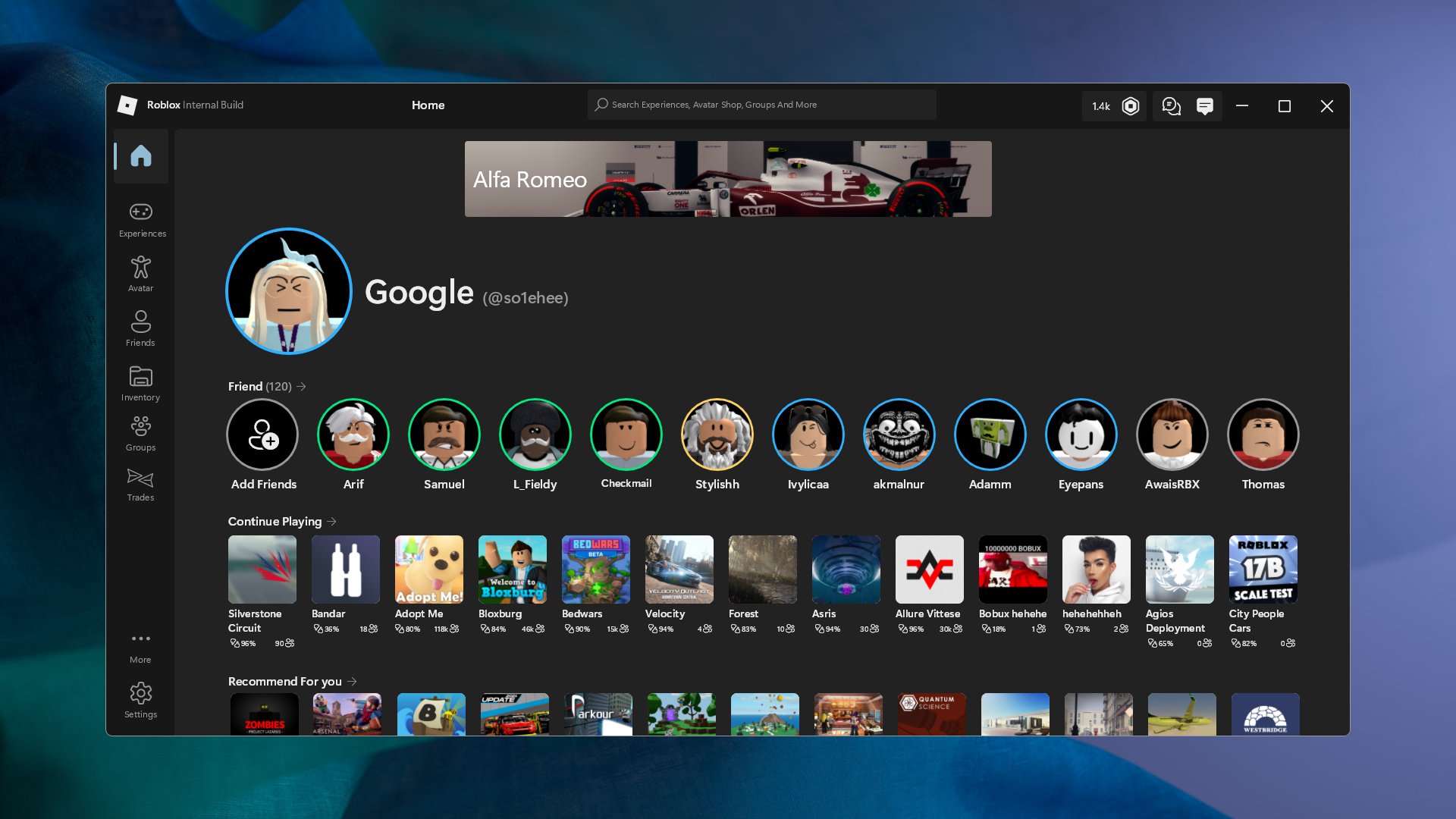

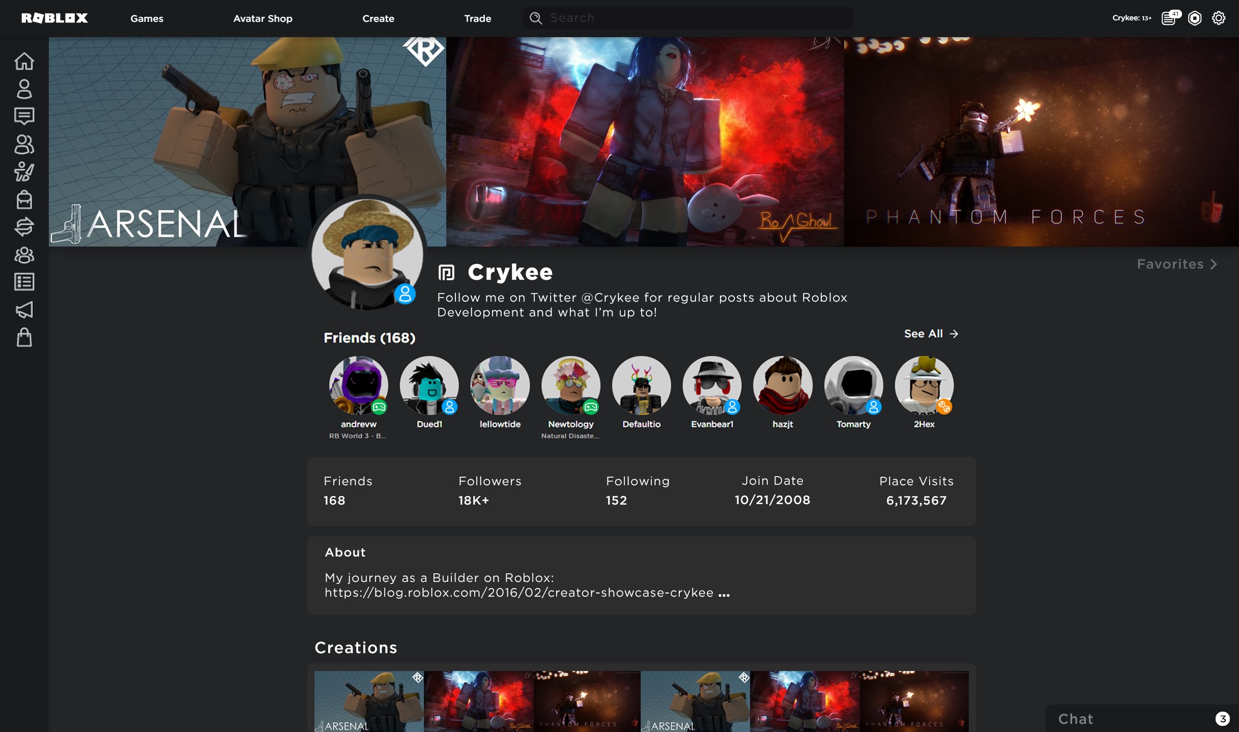
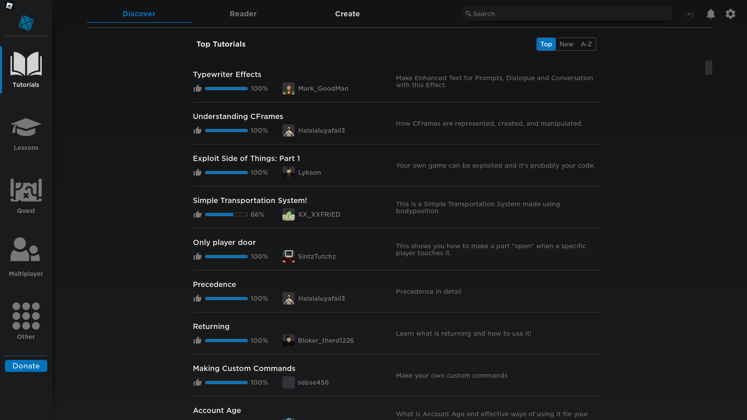
I love the subtle gradients and the clear boundaries of Ep1cDrew's. However, it's very tile-based which doesn't entirely work well for Lua Learning. The one by so1ehee is much flatter and minimal. Note also that Settings is an entire sidebar section there, and there is no subsection topbar. The sidebar has accent bars on the selected section, which I quite like. Crykee's page feels very empty and dense at the same time, and seems to be designed around displaying information like thumbnails that is not relevant to Lua Learning.
Results
Here is the current design of Lua Learning, that is live in production now. Note it does not support any other theme. It looks like this for everyone.
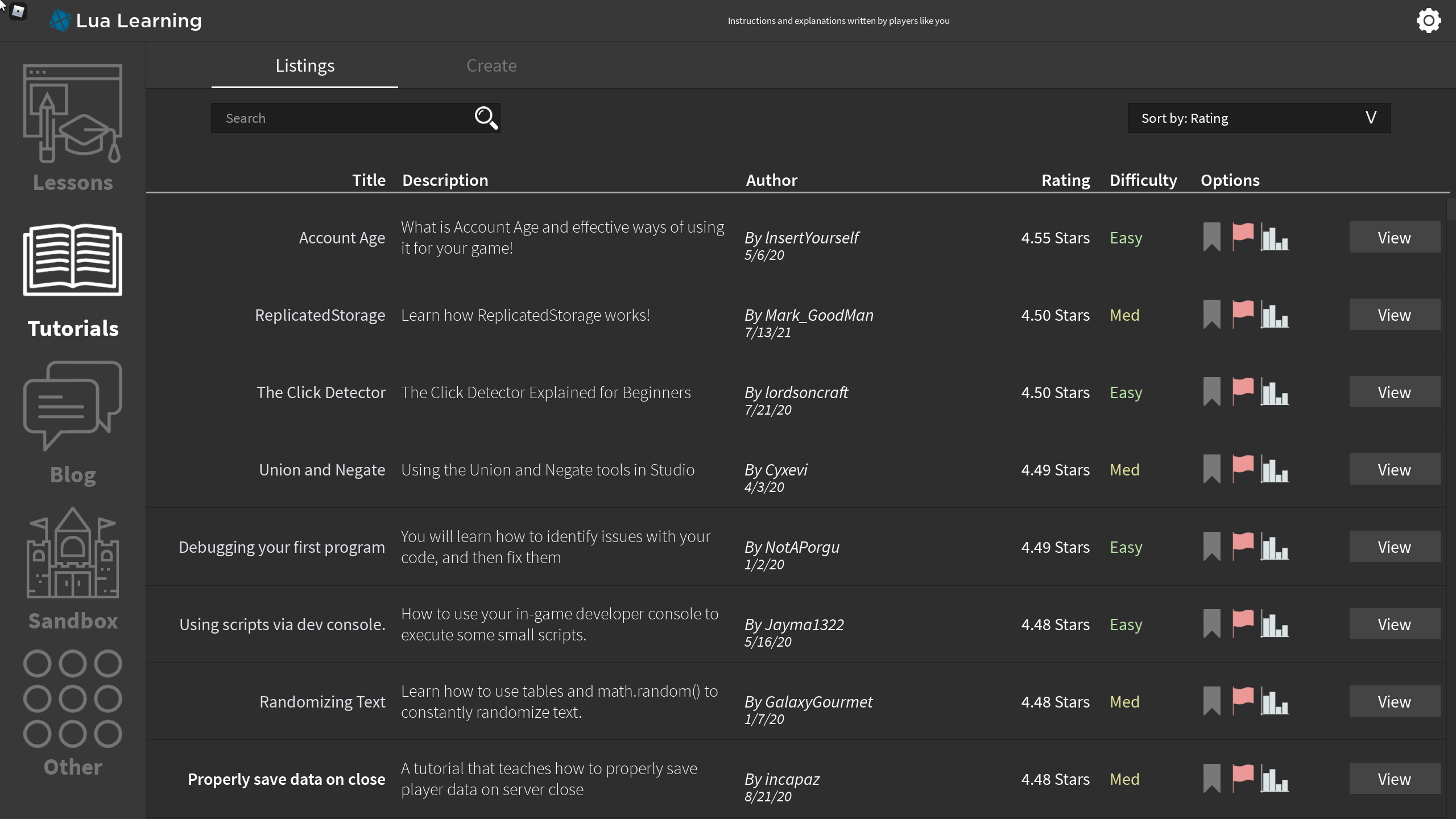
Here is a screenshot of the new UI showing the same page.